Thank you! Your submission has been received
Background
Project Overview
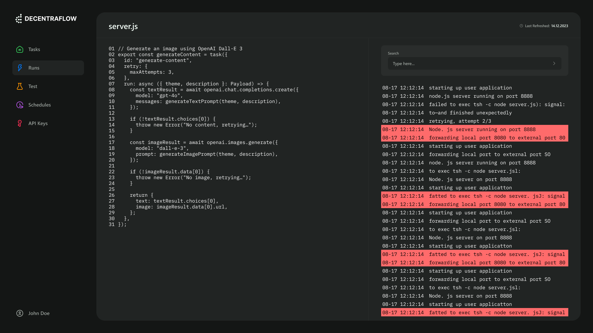
I’m excited to share how I redesigned workflow execution visibility at DecentraFlow. Our platform connects decentralized applications, smart contracts, and blockchain protocols. However, developers faced a major hurdle: unclear error messages. This led to frustration and project abandonment. My goal? To create a logging and reporting feature that transforms confusion into clarity.
Context
Problem, role and challenges
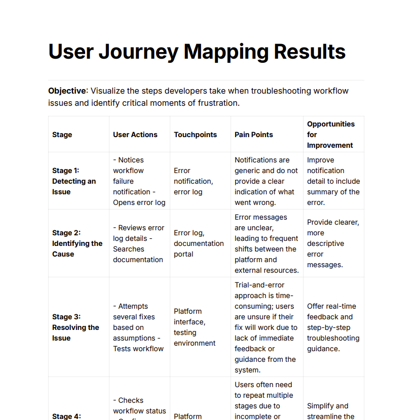
As the Lead Product Designer, I tackled a pressing issue: improving visibility in workflow execution. Developers struggled with vague error logs and lacked performance metrics. My role involved conducting user research, prototyping solutions, collaborating with developers, and leading usability tests. I wanted to empower users to optimize their workflows and reduce debugging frustration. I faced several challenges: - Understanding User Pain Points: Developers had diverse frustrations that needed to be uncovered. - Designing for Clarity: I had to ensure that error messages were not only clear but also actionable. - Collaboration with Developers: I needed to align design solutions with technical feasibility.

Frameworks
Research Methods
I designed a clean, modular interface where users could visualize and manipulate workflows. Each node represented a specific task, making it easy to connect them. I focused on: - Customization: Personalize nodes with colors and icons. - Interactivity: Drag, drop, and rearrange nodes. - Visual Clarity: Connecting nodes, showing relationships. I also included features like zoom controls and contextual menus for quick access to settings. This made the UI adaptable and user-friendly.

Processes
Findings, Approach & Iteration
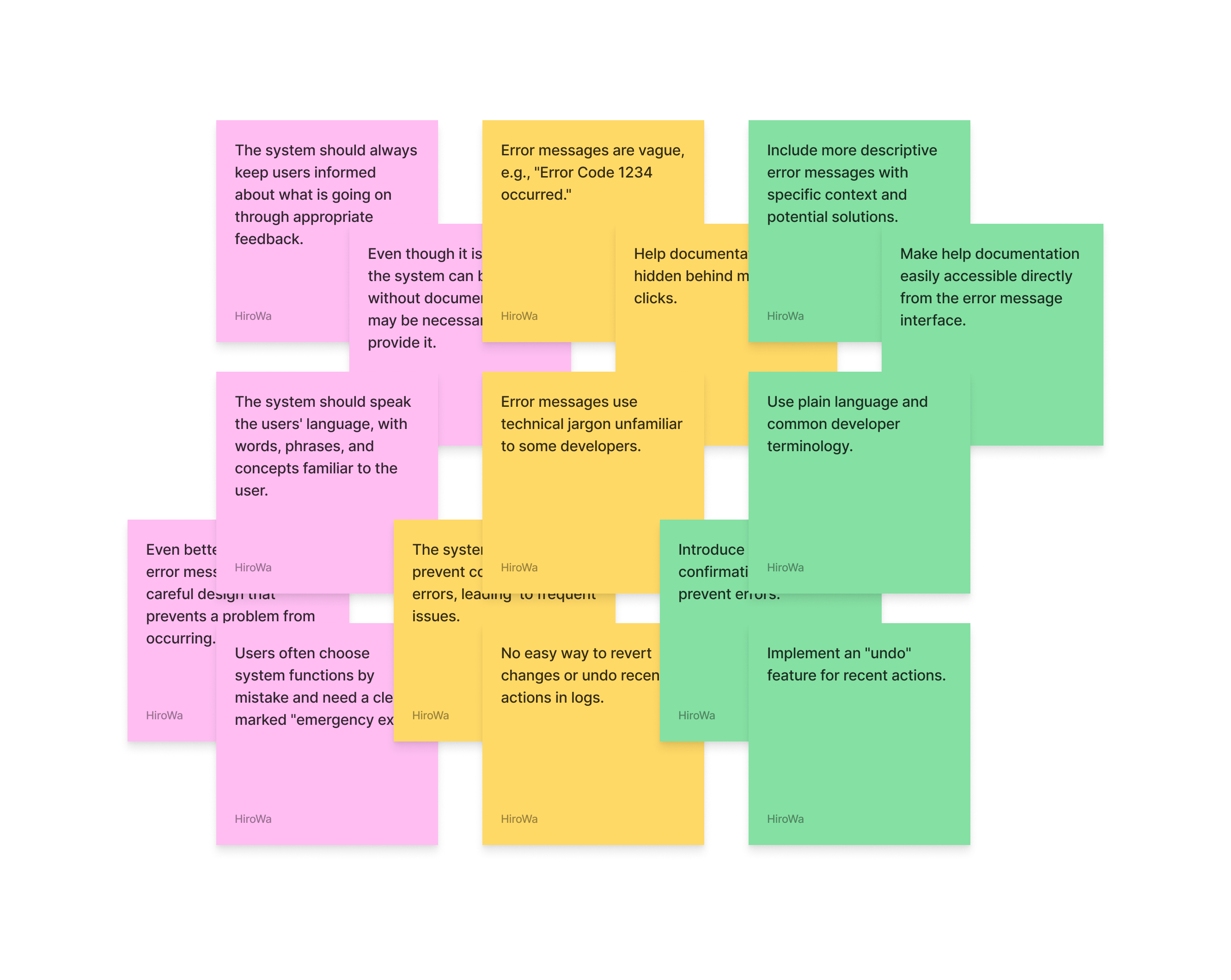
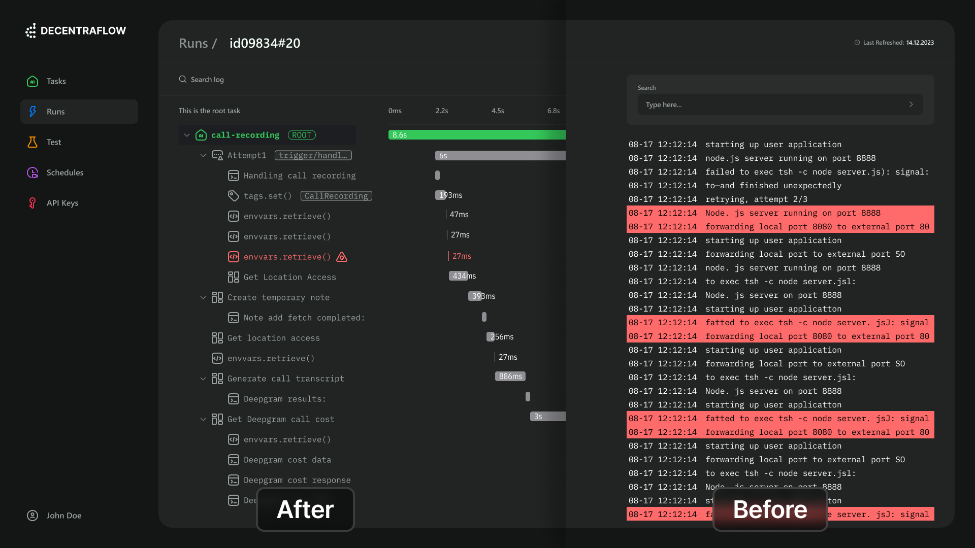
Key insights emerged: - 80% of developers found unclear error messages a major reason for abandoning projects. - 65% were frustrated by the lack of performance metrics. - 70% needed contextual information to troubleshoot effectively. I adopted a user-centered design approach, creating wireframes and prototypes for a new logging feature that included: - Detailed error messages with explanations and potential solutions. - Performance metrics for tracking execution times. - Actionable insights based on historical data. I led three rounds of usability testing with 20 users: - I observed interactions, noting confusion areas. - Surveys showed a 90% satisfaction rate with the new design. - I iterated based on feedback, refining the interface for clarity.


Conclusion
Successes & Lessons
The new log system UI transformed user engagement. Post-launch metrics showed: - Developer satisfaction soared by 85.47%. - Abandonment rate dropped by 37.12%. - Resolution time for workflow issues decreased by 42.35%. I learned valuable lessons: - Contextual Information is Key: Users need the "why" of errors. - Actionable Insights Build Confidence: Data recommendations empower users. - Visual Hierarchy Enhances Usability: Colors & Nodes simplify the experience. - Iterative Design is Essential: Feedback refines features.
Next Steps
What's next?
Looking ahead, I see opportunities for further enhancements. Integrating machine learning could predict potential workflow issues, providing users with insights before problems arise. In summary, the redesign of DecentraFlow's workflow execution visibility not only improved usability but also reinforced our commitment to a developer-friendly environment. The impact is clear: increased satisfaction and reduced abandonment rates among users.

©2015-2025 HiroWa. All rights reserved.
Product Design for 🤖 💸 🩺

